![]() Note: technical difficulties at Mailchimp prevented the mailing of this post yesterday. Apologies. Please also read today’s post THE DAILY EDGE (15 May 2018).
Note: technical difficulties at Mailchimp prevented the mailing of this post yesterday. Apologies. Please also read today’s post THE DAILY EDGE (15 May 2018).
MORE ON U.S. INFLATION
David Rosenberg on the April CPI, noting like me that the Cleveland Fed’s median CPI measure rose 0.24% in April following +0.25% in March, +0.15% in February and +0.34% in January for an annualized rate of +3.0% YtD, revealed that
According to research from the Cleveland Fed, the Median CPI provides a better signal of the inflation trend than either the all-items CPI or the CPI excluding food and energy. According to newer research done at the Cleveland Fed, the Median CPI is even better at forecasting PCE inflation in the near and longer term than the core PCE.
The chart below tends to verify the lead in the trends from median CPI, which puts greater probability of core CPI trending up in coming months.

Rosenberg points out the severe drops in April from airfares (-2.7%), used cars and trucks (-1.6%) and recreation services (-0.4%), calculating that, excluding these three components (9% of the core index), core CPI is up 0.2% in April vs the actual +0.1%.
He goes on showing the recent sharp increase in the Manheim used vehicle value index and suggesting that air fares will likely jump given the recent run-up in fuel costs.
 Source: @IanShepherdson (via The Daily Shot)
As I have been pointing out, the cost pipeline is dangerously full…

…either these cost increases are passed on or margins suffer. Either way…Hmmm…
-
Gas Is Headed for $3. What That Means for the Economy Drivers gearing up for trips this summer face escalating prices at the gasoline pump, an early sign that $70-a-barrel oil is starting to reach into consumers’ wallets.
(…) Morgan Stanley estimates that if gas averages $2.96 this year, it would take an annualized $38 billion from spending elsewhere, an upward revision from the bank’s $20 billion estimate in January. That would wipe out about a third of the additional take-home pay coming from tax cuts this year, the analysts said. (…)
Import prices increased 0.3% during April (3.3% y/y) after declining 0.2% in March, revised from no change. These figures are not seasonally adjusted.
A 1.6% rebound (20.6% y/y) in petroleum import costs led prices higher last month after a 2.2% March drop. Nonpetroleum import prices ticked 0.1% higher (1.7% y/y) following no change. (…)
Export prices strengthened 0.6% (3.8% y/y) following an unrevised 0.3% gain. (…)
Nonpetroleum import prices are up 2.0% annualized in the last 3 months, +3.6% in the last 4 months. Following 5 years of downward pressures on goods inflation, imports are contributing to higher inflation.

Farmers Across High Plains Brace for Hard Times as Drought Bears Down After three fairly wet years, a drought has descended on the southern Great Plains, one of the nation’s most fertile farming areas, affecting everything from cotton to cattle to farming-equipment sales.
Canada Shed Jobs in April, While Wages Rose to Near Six-Year High Canada unexpectedly shed jobs in April on a drop in part-time employment. Meanwhile, the unemployment rate remained unchanged at a decade-plus low and wage growth accelerated at its fastest pace in nearly six years.
Canada shed a net 1,100 jobs in April on a seasonally adjusted basis, Statistics Canada said Friday, following a net gain of 32,300 in the previous month.
The unemployment rate held steady at 5.8%, or the lowest level since October 2007. When using U.S. Labor Department methodology, Canada’s jobless rate in April was 4.9%.
On a one-year basis, Canadian employment rose 1.5% in April, or 278,300, with all of gains in full-time employment.
Full-time employment rose 28,800 after surging 68,300 in the previous month. This was offset, however, by a 30,000 drop in part-time work. More important, employment among the core-age population, or those between the ages of 25 and 54, climbed 29,000, driven by an increase among women getting full-time work.
Average hourly wage growth accelerated in April at its fastest pace since July, 2012, up 3.6% on a one-year basis. Every month so far in 2018 has recorded an hourly wage increase of at least 3% or higher. (…)

-
Canada: What’s behind the surge in wage inflation?
Canada’s wage growth is decidedly heating up, to the Bank of Canada’s chagrin. April’s Labour Force Survey showed an annual increase of 3.6% for the average hourly wage of employees, the highest since 2012. So what’s behind the surge in wage inflation?
Increases to the minimum wage in Quebec (May 2017), British Columbia (September 2017), Alberta, Saskatchewan and Manitoba (October 2017), all Atlantic provinces (April 2018), and of course Ontario (January 2018) have clearly boosted year-on-year comparisons for the average wage rate. Workers age 15-24, i.e. those more likely to earn the minimum wage, are seeing an annual wage inflation rate of nearly 9%, more than double the average for all employees.
But as today’s Hot Charts show, the uptrending wage inflation is also due to the tilt towards full-time jobs, the latter’s share of total employment rising to a decade-high of 81.6%. All in all, the latest data does nothing to change our view that the tight labour market will continue to fuel inflation pressures this year. (NBF)

EMERGING SUBMERGING
Rising Dollar Pummels Emerging-Market Bonds, Cooling Off a Hot Sector The dollar’s rise is squeezing bond markets in developing countries like Argentina, Indonesia and Turkey, gutting what had been a popular trade for investors seeking higher-yielding returns.
(…) Emerging markets added on $7.7 trillion in new debt last year, including bonds and other types of loans, with about $800 billion of that denominated in foreign currencies, according to data from the Institute of International Finance.
But as U.S. rates have started to climb, with the 10-year Treasury note touching above 3% for the first time since 2014, and the dollar rallied, more cautious investors have pulled away from riskier emerging-markets bets.
Investors have pulled about $4 billion from emerging-market bond funds over the past three weeks, according to data from EPFR Global, after investors last year poured about $70 billion into those funds.
A stronger dollar hurts developing countries by making it more expensive for them to service dollar-denominated debts and to pay for imports. Those problems are especially acute for nations like Argentina that import more than they export and depend on money from foreigners to help them cover that deficit. (…)
Few investors are calling a full-blown crisis in emerging markets, and many note that a number of emerging-market countries have taken steps to rein in spending and debt levels in recent years. Still, many believe the pressure is set to continue as investors pull back from riskier assets such as emerging-market debt to invest in higher-yielding U.S. Treasurys. (…)
Emerging markets were holding a record $6.3 trillion in dollar-denominated debt last year, according to IIF data. JPMorgan ’s index for emerging-market bonds denominated in dollars has fallen about 4% this year, driving up yields and essentially erasing any excess return that investors were earning by holding local currency emerging-market bonds. Yields rise as prices fall. The IIF now expects foreign portfolio debt flows to fall about 20% this year to $255 billion.
“It is enough of a risk that we’ve cut our forecast for portfolio debt flows this year for emerging markets,” said Sonja Gibbs, IIF senior director of global capital markets.
In a Dollarized World, Rising Dollar Spells Pain
(…) Dollarization, new research shows, means an appreciating dollar may hurt rather than help other economies by raising their import and debt costs. In fact, a rallying dollar may help explain why global growth has already faltered this year. The dollar’s dominance is also why the U.S. can isolate Iran simply by cutting off its access to the U.S. banking system.
Argentina’s problems are mostly homegrown: Inflation exceeds 20% and its current-account deficit, which includes trade and investment income, has widened. But those problems have been compounded by rising U.S. interest rates and expectations that fiscal stimulus will lead to even higher rates. This has drawn capital from Argentina, causing the peso to plummet 17% against the dollar this year.
And that’s a problem, because even though just 15% of Argentina’s imports come from the U.S., 88% of its total imports are invoiced in dollars, according to Harvard University economist Gita Gopinath. Thus, a rising dollar quickly jacks up prices in pesos.
Furthermore, Argentina’s various levels of government owe $98 billion in dollar-denominated debt and its private sector another $68 billion, equal to about a third of gross domestic product. As the peso falls, that debt becomes harder to pay off. The run on the peso has prompted the central bank to boost interest rates to 40% and Tuesday, the country asked the International Monetary Fund for a credit line.
Argentina’s vulnerability is extreme but not unique. Ms. Gopinath has found that around 40% of world trade is invoiced in dollars, roughly four times the U.S. share of world trade. Moreover, developing countries collectively owe $2 trillion in dollar-denominated debt, according to the Bank for International Settlements. (…)
The saving grace is that the dollar so far hasn’t risen much relative to last year’s drop. How much further it goes depends a lot on the Fed. In a speech Tuesday, Chairman Jerome Powell said rising U.S. interest rates should “prove manageable” for emerging markets given they haven’t been surprised and have much better fiscal and monetary policies than in the 1980s and 1990s. (…)


Why the Oil Spike Won’t Last Citigroup’s Ed Morse has been right about the price of oil for years. In the wake of the Iran deal exit, here’s what he sees ahead.
(…) The Kremlin was quoted [Tuesday] as saying new sanctions from the U.S. on Iran could bring an end to the supply agreement. Clearly, President Trump—who has tweeted on the subject of gasoline prices—would likely be putting pressure on Middle East allies who are the beneficiaries of what he’s doing. They could be under pressure to bring more oil into the market for the summer in time for gasoline season. So that’s the other unknown.
I think the short term is a tighter market, and the long term is going to be a looser market. And by the long term I mean a year from now, because higher prices are creating more production growth in the U.S., in Brazil, in Canada, and in some other offshore areas. (…)
We had calculated—in the case of a risk like this—that the price of Brent could average $79 a barrel come the end of the third quarter into the fourth quarter. That means that it would be trading over $80 for a period of time, and we think that triggers enough oil to bring the price down to $20 to $25 below that level by this time next year. So 2019 is likely to see oil trading not in the high $70s, but in the low $60s or the high $50s. (…)
We think that this year could see 2.5 million barrels a day of liquids growth from the U.S., Canada, and Brazil. That’s more than demand growth again. It will eventually kind of overwhelm the market and you’ll see inventory build. And as OPEC returns to the market, then the market will get looser again and prices will fall. We think prices will fall even without OPEC. (…)
Now big companies like Exxon Mobil (ticker: XOM), Royal Dutch Shell (RDSA.UK), BP (BP), and Chevron (CVX) are in the shale plays and they are drilling, and combined they are planning to increase their production in the U.S. by two million barrels a day by 2023 or ’24.
They are not like the [smaller] oil companies. They are unlikely to stop producing at a certain price point because getting that production into the market is their main goal. Lower prices are not going to deter the new entrants, the majors who were left out of the first round, into the shale plays. They are now very much in the second round.
Another big difference is that they used to do contracting by drilling rig. When the rig went off contract, they could let it go, and a rig cost them on average around $5 million a well to drill. They could use a rig or not use a rig. Now the companies in the Permian Basin are thinking not one-well-at-a-time drilling, but pod drilling. So the project costs $110 to $130 million, rather than a $5 million well. They are not going be able to pull back as quickly from the drilling activity as they did when prices collapsed in 2015 and early 2016. (…)
-
OPEC Output Rises on Higher Crude Production in Saudi Arabia The group’s total crude output rose by 12,000 barrels a day in April
(…) The world’s total oil supply continued to accelerate in April, climbing by 120,000 barrels a day month-on-month, to average 97.89 million barrels a day, almost all of which was driven by non-OPEC production—including the U.S., the U.K., Brazil and China, OPEC said.
U.S. shale fracking continues to be one of the main engines of non-OPEC supply. Tight and shale formations are expected to average 5.76 million barrels a day, accounting for 94% of total U.S. petroleum supply in 2018, according to OPEC.
The oil-cartel expects non-OPEC supply in 2018 to grow by 1.7 million barrels year-over-year, nearly 90% of which should come from the U.S.
OPEC raised its global oil demand forecast for 2018 by 25,000 barrels a day, to increase by 1.65 million barrels a day and average 98.85 million barrels a day.
Commercial oil inventories in the Organization for Economic Cooperation and Development—a group of industrialized, oil-consuming nations that includes the U.S.—fell by 12.7 million barrels in March, to stand at 2.829 billion barrels, OPEC said. That is just 9 million barrels above the oil-cartel’s target of the last five-year average.
EARNINGS WATCH
The weekly summary via Factset:
Overall, 91% of the companies in the S&P 500 have reported earnings to date for the first quarter. Of these companies, 78% have reported actual EPS above the mean EPS estimate, 6% have reported actual EPS equal to the mean EPS estimate, and 17% have reported actual EPS below the mean EPS estimate. The percentage of companies reporting EPS above the mean EPS estimate is above the 1-year (74%) average and above the 5-year (70%) average.
In aggregate, companies are reporting earnings that are 8.3% above expectations. This surprise percentage is above the 1-year (+5.1%) average and above the 5-year (+4.3%) average.
In terms of revenues, 77% of companies have reported actual sales above estimated sales and 23% have reported actual sales below estimated sales. The percentage of companies reporting sales above estimates is above the 1-year average (70%) and well above the 5-year average (57%).
In aggregate, companies are reporting sales that are 1.0% above expectations. This surprise percentage is below the 1-year (+1.1%) average but above the 5-year (+0.6%) average.
The blended, year-over-year earnings growth rate for the first quarter is 24.9% today, which is higher than the earnings growth rate of 24.2% last week.
The blended, year-over-year sales growth rate for the first quarter is 8.2% today, which is lower than the growth rate of 8.5% last week.


At this point in time, 86 companies in the index have issued EPS guidance for Q2 2018. Of these 86 companies, 50 have issued negative EPS guidance and 36 have issued positive EPS guidance. The percentage of companies issuing negative EPS guidance is 58%, which is well below the 5-year average of 72%.
-
First-quarter earnings season was great—except for this small thing Despite all the profit and sales beats, estimates for the second quarter have remained stubbornly static
(…) “The recent uptrend in the exchange value of the U.S. dollar and questions about global growth will likely serve as incremental negatives for folks like us monitoring the aggregate revisions trend.” (…)
Barron’s adds
(…) Here’s the rub, according to Colas: That analysts aren’t hiking second-quarter numbers after a strong first quarter, as they normally would, implies a lack of confidence. (…) Moreover, while second-quarter profit estimates remain high, that is largely due to the energy, materials, and tech sectors. Everywhere else, analysts are cutting growth estimates, on average. (…)
![]() But John Butters, senior earnings analyst at FactSet, says EPS estimates typically fall in the first month of a quarter. In the last 20 quarters, EPS estimates have recorded an average decline of 1.8% in the first month. In the last 40 quarters, the estimate has declined an average 2.3%.
But John Butters, senior earnings analyst at FactSet, says EPS estimates typically fall in the first month of a quarter. In the last 20 quarters, EPS estimates have recorded an average decline of 1.8% in the first month. In the last 40 quarters, the estimate has declined an average 2.3%.
As to the last assertion that “everywhere else, analysts are cutting growth estimates, on average”, earnings revisions indices remain positive for all sectors but Real Estate according to Thomson Reuters IBES data.
TECHNICALS WATCH
An indicator that’s ‘90% accurate’ suggests hidden strength in the stock market
There are multiple signs of equity strength going on below the surface of the major indexes, which could be a signal that the recent uptrend in stocks is justified and could continue.
One positive signal looks at the ratio of rising stocks on the New York Stock Exchange to the number of falling ones over time. Paul Schatz, the president of Heritage Capital, referred to this as “the one indicator that’s 90% accurate” for forecasting moves.
Currently, the NYSE’s advance/decline line is at an all-time high, as seen in the following graphic from StockCharts, which Schatz included in an email.

“When the major stock market indices make new highs but the NYSE A/D Line does not, that’s where bulls should begin to worry,” he wrote, adding that “the exact opposite is happening,” which he said was “typically a good sign for further strength in stocks over the medium-term.” (…)
Both the Dow and the S&P have shown signs of maintaining their longer-term positive momentum. Both broke below their 200-day moving averages on an intraday basis twice last week, but they subsequently rebounded to close above it each time. Ending below that level, a closely watched gauge for long-term price trends, is seen as a bearish signal, but holding it could be a sign of support for equity prices. Since testing the level, the Dow and S&P have returned above their 50-day moving averages, which is used as a proxy for short-term momentum trends. (…)

According to StockCharts, 61.1% of the S&P’s components are now above their 200-day, up from just 50% last week, and back above the 59.55% average over the past 50 sessions (the 200-day average for S&P 500 components above their 200-day moving average is 69.44%).
For the 50-day moving average, 61% of the S&P’s components are above this level. That’s above this ratio’s 50-day and 200-day averages, as well as up from 47% last week.
Ari Wald, head of technical analysis at Oppenheimer, added that the number of net new lows — the number of stocks making 52-week highs minus the number making 52-week lows — had been dropping, a trend that suggests “the selling in stocks is getting less bad.” (…)
Lowry’s Research continued positive readings have, so far, proven right. Lowry’s sees breadth encompassing all three market segments. “As of May 10th, our Large, Mid and Small Cap Operating Companies Only (OCO) Adv-Dec Lines were at new bull market and new all-time highs, as were the S&P Large, Mid and Small Cap Adv-Dec Lines. Such broad-based support suggests a healthy rally is in place. (…) Most importantly, new highs in both Adv-Dec Lines have historically signaled a healthy bull market.”
Here’s Lowry’s Supply-Demand chart showing the continued decline in Supply. Demand is lacking momentum but remains reasonably steady.

Why the Buyback Boom Is Bullish for Investors S&P 500 company repurchases offer shareholders an effective “yield” of 3%; Apple, JPMorgan, and Citigroup are attractive opportunities.
(…) Standard & Poor’s 500 companies are on track to announce $650 billion worth of buybacks this year, according to a Goldman Sachs estimate, smashing the previous record of $589 billion set in 2007.
Buybacks offer investors an effective “yield” of about 3%, calculated by dividing repurchases by the $23 trillion market value of the Standard & Poor’s 500 index. Combine that with the 1.9% current dividend yield and investors should get a nearly 5% combined yield this year. (…)

SMALL REALLY NOT BEAUTIFUL
Two weeks ago, I posted TOPSY CURVY: SMALL IS NOT THAT BEAUTIFUL, discussing corporate USA’s very high leverage in this environment of scheduled interest rates increases, particularly that of smaller companies. This week, Evergreen Gevekal’s EVA publishes a piece from Eric Cinnamond, a seasoned small cap portfolio manager who explains why he is totally out of small cap stocks:
(…) In my opinion, high quality small caps are the most expensive I’ve ever seen them. For the first time since 1993 I don’t own one stock – I am completely out of the market. Looking through my possible buy list there is very little I would consider to be a good investment or that will generate adequate absolute returns relative to risk assumed. (…)
When I look at some of the stocks I owned over that past 20 years that were trading at 10-15x earnings at the time of purchase and that are now trading at 20-35x earnings, I ask myself, “Who in the world is buying these things?” When I pull up the top holders to discover the culprits, I often see the most popular index funds and ETFs. (…)
Why are valuations of mature high quality small cap stocks so expensive? (…) I believe the shift to indexing and passive investing is also responsible. Index funds do not care about earnings yields, risk premiums, margins of safety, cash flows, and on and on. When an index fund receives an inflow, it buys the stocks in the index regardless of fundamentals and price. I believe this sort of price indifference is one of the main reasons valuation multiples have expanded significantly this market cycle. (…)
What happens when all of the index funds (the top holders) have outflows during the next bear market? Who will they sell to? They can’t sell to each other as they’ll all be selling at the same time to meet redemptions. Furthermore, since they’re fully invested they don’t have cash buffers and will have to liquidate holdings immediately, or that day. Just as they’re price insensitive on the upside, they’ll also be price insensitive on the downside. (…)
Here’s the key chart showing record high P/S totally unsupported by operating margins:

Note that this chart does not seem to include Q1’18 results. This next one from Ed Yardeni uses forward earnings with the effect of the tax reform, a timely boost for steadily declining margins, even among the higher quality S&P 600 companies.

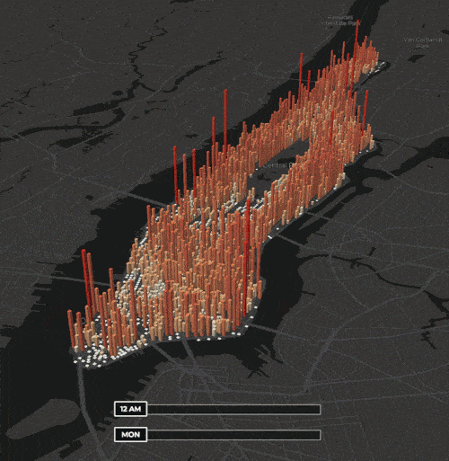
Heart of NYC
Pretty cool stuff!
Commuters make Manhattan’s population double from 2 million to 4 million people every day during the work week. But that influx of people scattered on the densest borough’s busy streets can be difficult to wrap your head around. Take a look at this GIF of a new interactive from geo-spatial data scientist Justin Fung, and you’ll catch the rhythm of the city’s working heartbeat.
Fung pulled together data from the 2010 Census, MTA turnstile data, and a previous NYU Wagner dynamic population study to produce the hourly, block-by-block population bars that arguably demonstrate the need for skyscrapers—or a least, lunch spots, since peak Manhattan population hits on Wednesdays at 2 p.m. CityLab context: An economic explanation of New York’s skyscrapers and Where do the five boroughs of New York live and work?
1 thought on “THE DAILY EDGE (14 May 2018): EMERGING SUBMERGING”
Screaming inflation chart at FRED: https://fred.stlouisfed.org/graph/fredgraph.png?g=jRpH
Comments are closed.